Interpreting a Scatter Chart Analysis
With Innolink’s Scatter Chart Analysis, we can see behind the average values and select certain claims and “break them down” into point clusters, at which point you can identify, for example, factors shared by critical respondents.
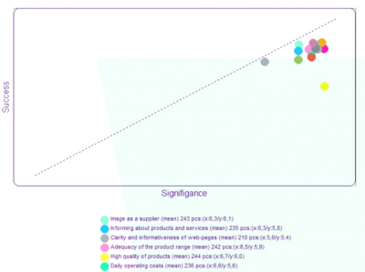
The Scatter Chart Analysis is formed based on the average grades of the importance and success grades. On the horizontal axis of the Scatter Chart Analysis, the importance of the factor to the respondent is shown and on the vertical axis your organisation’s success in the factor in question.
The line from the left lower corner to the right upper corner is the so-called target line; factors on the target line have success and importance at the same levels.
- Answer dots placed clearly above the target line = an overcontribution factor
- Answer dots placed clearly below the target line = a critical factor
- Answer dots placed close to the target line on both sides = a success factor
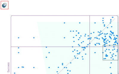
By clicking a wanted operational factor under the chart, the distribution of answers (set of points) will be displayed. In the same view, you can select answers, at which point a box will appear around the points.
By selecting the Common factors icon in the upper left corner, you can display the common factors of the selected respondents and, as such, other factors that differ from the rest of the material.
You can also browse selected responses by selected Browse Answers from the analysis tree. The function can be used in customer research. Read more about browsing research responses.